Microsoft PowerPoint is a great solution for presentations. PowerPoint has templates that are used to design your presentation. It has also many different useful features. One of them is that you can add images and manage them.
Sometimes you may need to focus the audience’s attention on a particular object in the photo. You can reach it by highlighting a part of an image in your presentation. It can be done using simple options in the program. So here’s how you can do it.
Why are images important in the presentation?
The recipe for quality content – whether it’s a presentation or an e-course – is a pleasant design and a confident narrator with an interesting story. And if you add a little creativity to the mix, your material will “shoot” even more powerfully.
Both at school and university, I was always told – less text, more pictures. A presentation with images is better than a boring text presentation. Images make your thesis statement much clearer to the audience, so it stays in their memory much longer.
The selection of images is no less important than the idea and content of the speech. Any presentation aims to feedback. The goal of the speaker isn’t only to make the audience listen and watch until the end (although this goal isn’t easy to achieve) but also to explain in a way that makes it memorable, to inspire listeners to certain actions.
Agree that it’s all about emotion. Images that evoke laughter or fear, excitement or compassion are better remembered and help convey the main message better. That’s why it’s also important to know how to manage images in Microsoft PowerPoint.
Read Also:
- How to import slides from another presentation to Google Slides
- How to add or remove slides numbers in Google Slides
- How to add a header or footer to Google Slides
How to select a part of an image in Microsoft PowerPoint
Any presentation will look much nicer and more beautiful with images. Nevertheless, there has to be a balance in everything. Sometimes you may want to highlight a certain part of the image in your presentation so that people pay attention to a particular object in the photo. However, first, you have to create a presentation and add images.
How to add an image in PowerPoint
If you want to add an image in PowerPoint – follow these steps:
- First of all, open your PowerPoint presentation and select a slide.
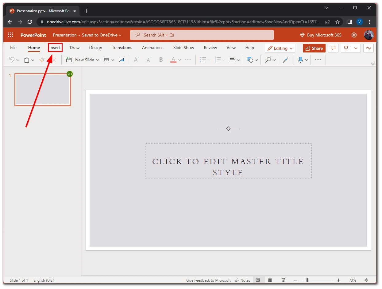
- Then click on the “Insert” tab.
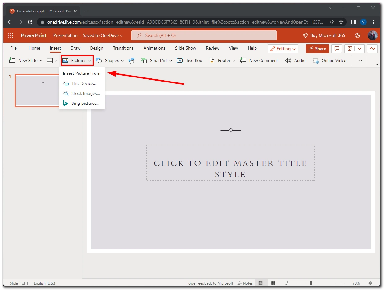
- After that, click “Pictures” and select where you want to add an image from. You can also select a design of your slide that automatically synchronizes an image and text.
Once you have completed these steps, you have an image only on your slide. Now, you can start highlighting the object on it.
How to highlight an image in PowerPoint
Follow these steps to highlight an image in your PowerPoint presentation:
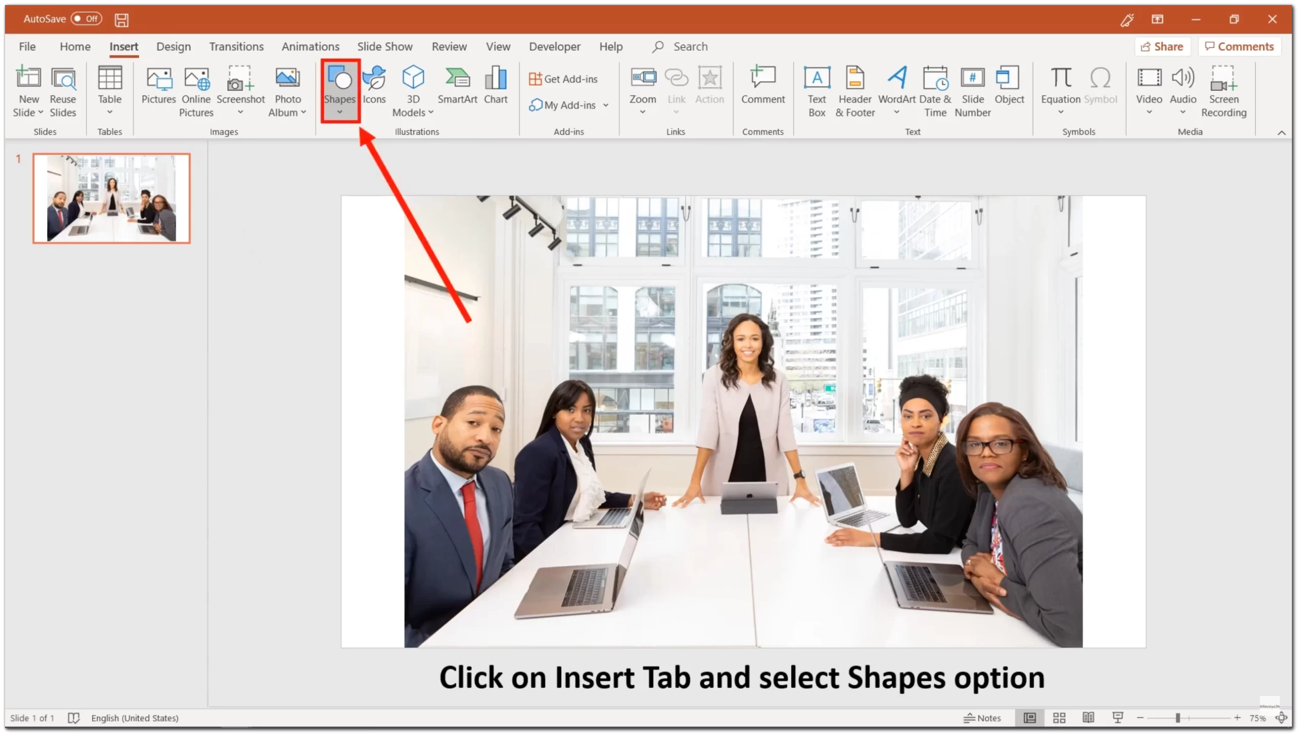
- Head to the “Insert” tab and click “Shapes”.
- Select the shape you want to use. It’s better to choose a rectangle or oval.
- After you create a shape, you can modify it by dragging it to move it or by pulling in or out of a corner or edge to resize it.
- Now, select an image and then a shape. You can do this by holding down Ctrl on Windows or Command on a Mac as you click each shape. Be sure to select the image first.
- Go to the “Shape” tab.
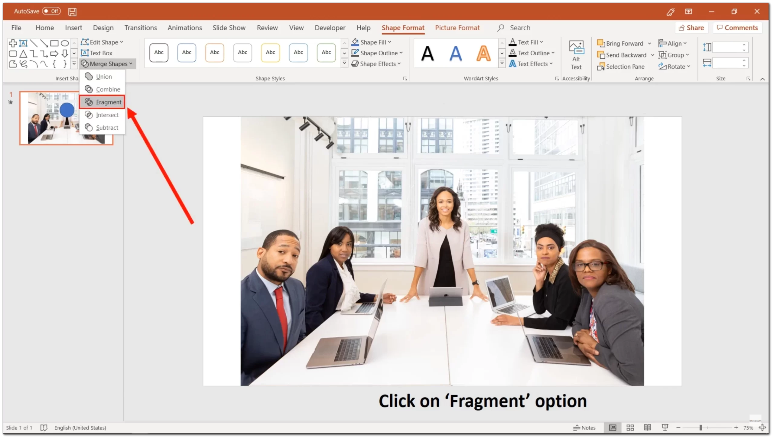
- Click on the “Merge Shapes” option and select “Fragment”.
- Then go to “Picture Format” and click on “Artistic Effects”.
- Select the blur effect. You can choose a different effect if you prefer.
Finally, you will see the fragmented shape in full focus, and the rest of the image will be blurred, allowing that part to stand out. You can also make changes to the effect. Just right-click on the image and select “Format Picture”. You can then use the slider to increase or decrease the degree of blur. If you choose an effect other than a blur, you may see other options.
Unfortunately, this option isn’t available in the PowerPoint free version. That’s why you can highlight an image only if you have a Microsoft Office subscription.
How to speed up the perception of information in the PowerPoint presentation
Icons and graphics of all kinds make your message easier to understand. Use them in your presentation, but make sure they are in the same style, otherwise, the slides will look sloppy.
If you take icons that are filled with color, they should all be that way. If you take the outline, they should all be outlined. Well, and the size, of course, they must also be the same.
Also, you should keep in mind that one slide should have one thought and one image that fits its meaning and reinforces its emotional message. If there are more images, it will have the effect of overloading.


